Researching The Witch’s Kiss

Researching The Witch’s Kiss

[This blog post was part of our blog tour and was originally posted over on Bart’s Bookshelf.]

We both LOVE history – love it so much we both studied it at university – so we knew right from the beginning that we wanted to set the ‘fairy tale’ bit of The Witch’s Kiss in the past. But, there’s a lot of past to choose from…

After a bit of thought, we decided that we didn’t want to go with a generic, ‘medieval’ sword and sorcery setting. Yet we knew that the story of Jack, and how he ended up cursed, needed to be set far enough in the past to have that slightly other-worldly, fairy tale feel. Plus, why have a Sleeping Beauty character that only sleeps for a hundred years, when you can have him sleeping for centuries? In the end we picked late 5th / early 6th century Anglo-Saxon England as our setting for the historic sections. And although The Witch’s Kiss is fantasy, we wanted to make sure we described Queen Edith’s court, and the village were Jack grows up, as authentically as possible.

So the first thing we did was buy a whole load of books – yay!!

books
Some of our lovely, lovely books


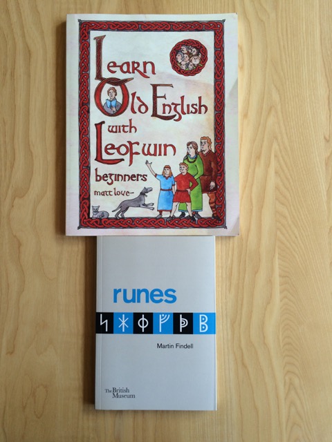
We read history books – Max Adams is BRILLIANT, by the way: his books are as gripping as any novel – and some of the surviving literature from (very approximately) the same time period. The nerdier of the two of us (naming no names) now has three different versions of Beowulf, and really recommends the Seamus Heaney translation.

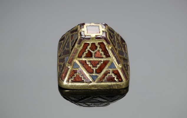
There are also, of course, a lot of amazing resources on-line and out there in the real world. To get an idea of what our Anglo-Saxon characters might wear and how they might live, we looked at websites like Tha Engliscan Gesithas and Anglelcynn Re-Enactment Society. We also visited the wonderful Anglo-Saxon section in the British Museum (where we spotted Jack’s ‘seax’) and we were lucky enough to see the Staffordshire Hoard on display at Lichfield Cathedral (the design of the handle of The King of Heart’s sword is inspired by an item in the hoard).


AN00034869_001_m
The Battersea Seax at The British Museum
timthumb
A garnet & gold sword pyramid from The Staffordshire Hoard

And then there’s the language. Obviously, we couldn’t write the Anglo-Saxon sections in actual Old English. But when faced with a choice of words, we did try to use ones derived from Old English (rather than Latin or French, for example) wherever possible. And we carefully avoided anything obviously anachronistic. Personally, it makes us want to tear our eyes out when a pre-twentieth century book character goes around saying stuff like “What’s up? You okay?”

As well as choosing the right kind of modern English, Merry, our hero, has to cast a few spells in Old English. So back when we were writing the first draft (way before agents and publishing deals) we had a go at constructing some appropriately spell-like Old English sentences. Cue more books:


Books2
Leofwin is awesome, BTW

Merry has some difficulty dealing with Old English when under pressure:

Merry gasped as whatever had been pinning her in place – terror, or magic – vanished.

‘Damn –’

She dropped her phone and fumbled for the parchment. There was a new line of writing, an instruction.

The monster is intent on sin. Name his name to draw him in.

There was a single sentence underneath:

Æstand, heortena cyning

Was she supposed to translate it? Right now?

‘Seriously?’ Merry yelled at the manuscript. But Jack was getting further away. Merry swore again, and ran after him.

Luckily our publishers got our attempts at old English professionally checked before going to press, but we were pretty pleased to find that we weren’t too far off.

As you can (hopefully) tell, we had a huge amount of fun researching the historical aspects of The Witch’s Kiss. Almost too much fun. So our message to any other writers out there thinking of dipping a toe into historical research is: go for it, but remember you also have to write the book. J


Interview with our cover designer

Of course, the words inside the covers are the most important thing about a book. But there’s no denying that a beautiful cover can draw the eye and convince someone to pick up a book which she otherwise might have passed over. We’ve been lucky enough to end up with a truly stunning cover for The Witch’s Kiss, so we decided to find out a bit more about the cover design process by interviewing the creator of our artwork, the lovely Lisa Brewster from Black Sheep Design


Screen Shot 2016-02-09 at 18.04.33
The final cover design

1) Why do you think cover design is so important?

Designing a cover is so important as it initially helps the consumer choose the book they wish to read ( judge a book by its cover). Based on their initial reaction to its engaging typography and imagery the reader makes a decision, whether this is seeing a book in a bookstore or online seeing a thumbnail image. Designers are conveying in a split second the author branding, age group, genre of the book, helped along with a shout-line to draw the reader into the content of the book. A lot of consideration goes into the styling and treatment of a cover depending on what’s most suitable. Illustrative, typographic or photographic approaches are pinned down to the hit the right target audience. I love working in different styles so it never gets boring!

2) Can you describe in general terms what you do: what is the process for getting from publisher’s instruction to finished cover?

As a general rule I receive a detailed brief from the publisher containing all the information I need, starting from the author name and title. The brief will explain the theme and feel of the book along with a synopsis of the story-line, key themes or events, descriptions of characters – any relevant details they think I may find useful in creating the cover. Sometimes a mood-board of other titles in the same genre will be listed for reference, to help me either get a sense of the style of book it is, or to emulate the success of similar book that’s already in the market.

3) How did you come up with the design for The Witch’s Kiss?

Within the brief I was provided with the details of a great black thorn forest. I thought immediately of the film Maleficent and Grimm woods as a starting point. I explored this concept in several different styles, all slightly sinister, illustrative, bold and iconic.
I usually provide a set of different visuals/styles to the client to have initial feedback on. This helps narrows down the solutions and direction the client wishes me to pursue and develop.
Inevitably there are changes with the sales team and publisher before we decide upon a final cover design. It’s a tricky balance refining the idea to have the best impact!

image003
An earlier version of the cover


4) How did you end up as a cover designer? What alternative design based career would you like if you hadn’t gone down that route?

Growing up I wanted to be in animation. I was brought up on Disney, but after a work experience in advertising, a now mutual friend put me in touch with the guys at Blacksheep as he felt I was more illustrative based and would be more suited in publishing. That was twelve years ago!

5) What are your five favourite covers (designed by you or by others)?

1) GRIMM TALES by Philip Pullman (Paper Art by Cheong-ah Hwang and Matthew Young).
2) The Martian by Andy Weir.
3) Moby Dick cover by Herman Melville (Umberto Scalabrini).
4) Bête by Adam Roberts ( James Macey).
5)Tony and Susan by Austin Wright.


Thank you so much for taking the time to talk to us, Lisa!

Lisa

You can follow Lisa on Twitter:@lisablacksheep

And don’t forget to check out the Blacksheep website here: Blacksheep Design